Diego Delgado-Elias
Identity & Website
2022
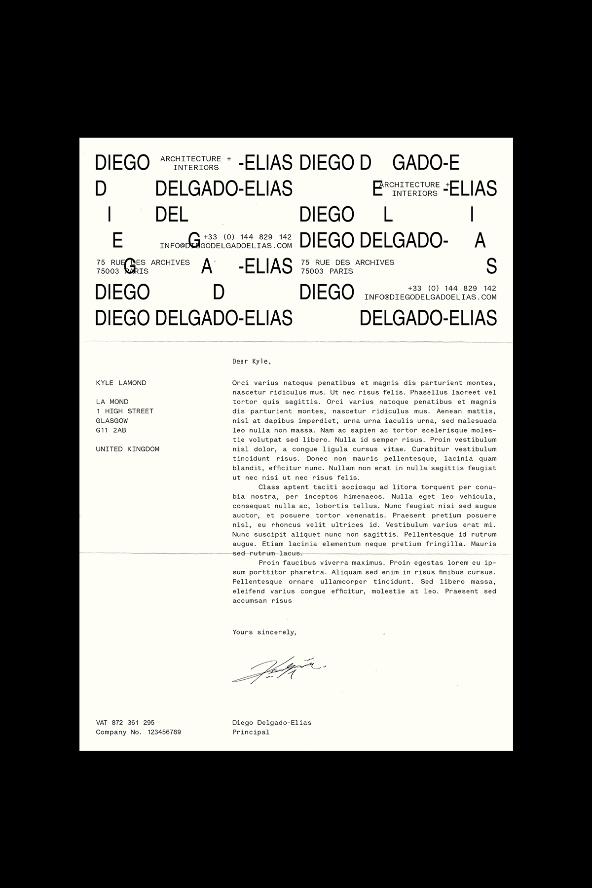
The typographic system aims to a create unique form of order within a composition that may at first appear to be in disorder. The sporadic and disconnected repetition of the wordmark guides you to construct a 'clear' visual for the logo. It contrasts a mix of old and new with the utilisation of mono-spaced typeface, Lettera, that emulates a timeless typewriter aesthetic being juxtaposed with the contemporary condensed sans-serif .
The overlapping type acts as an ode to the inconsistencies and mechanical faults found with use of a typewriter.


